When we work on personal projects, it’s interesting to do it about subjects we love. I love animals and especially dogs and horses.
I have a lovely american cocker who spends his time while sleeping and playing. It is by looking at him that I wished to create in a first time a lettering. In addition to that, I read a lot of books about this specialty the last weeks. Then, with some researches, I decided to create an illustration. It’s in this context that « Lazy dog » was born.
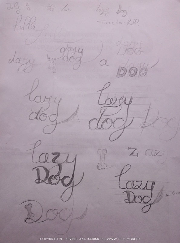
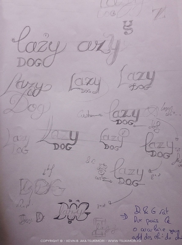
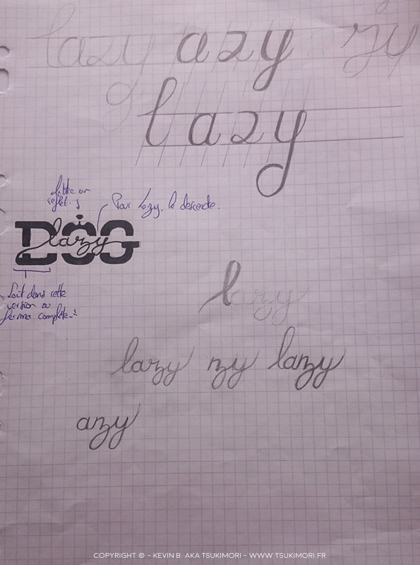
Step of the sketch for Lazy dog.
At first, the project was to be only a lettering. I have a Bullet Journal and I wished to inspire me from the July header page that I created: A lettering of a single block.
After some tries, I made some researches on the one hand to find inspiration and on the other hand to understand the methodology for create a lettering. Change some characters parts with bones, put a dog tail at the end of the G, etc.
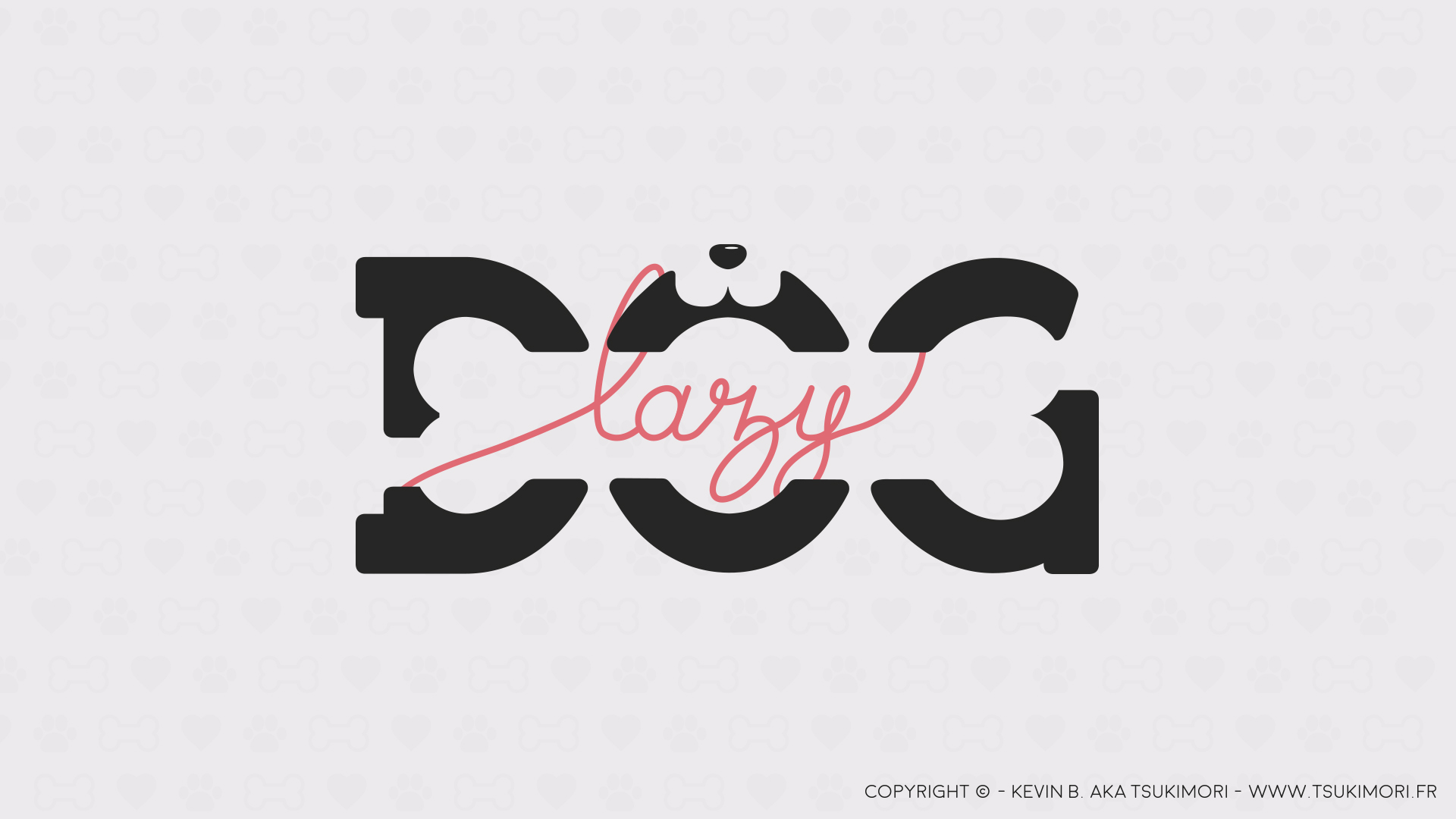
To keep the single block idea, I began to mix different types: Sans-Serif and Script. That’s when I wanted to create an illustration in addition to the lettering and to use the negative space to reveal some shapes like the dog and bone. This gives the impression that the dog has a bone in his mouth.
The result !
At first, thank you to take your time to read this article! I’ll try in the future to create this kind of description when I wish to present you a project here or on Behance. If you want to see the « Case Study », you can check here: Link.
This is the first time I create it but don’t hesitate to give me your opinion and your suggestions to improve all that!
Big up to all american cockers and dogs!
